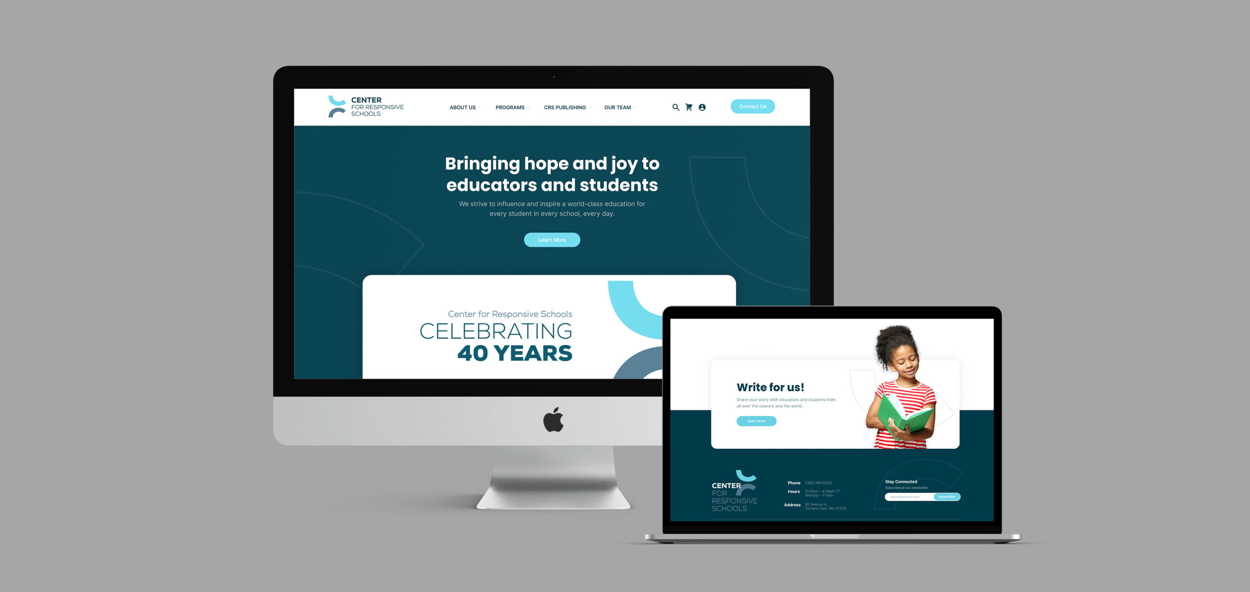
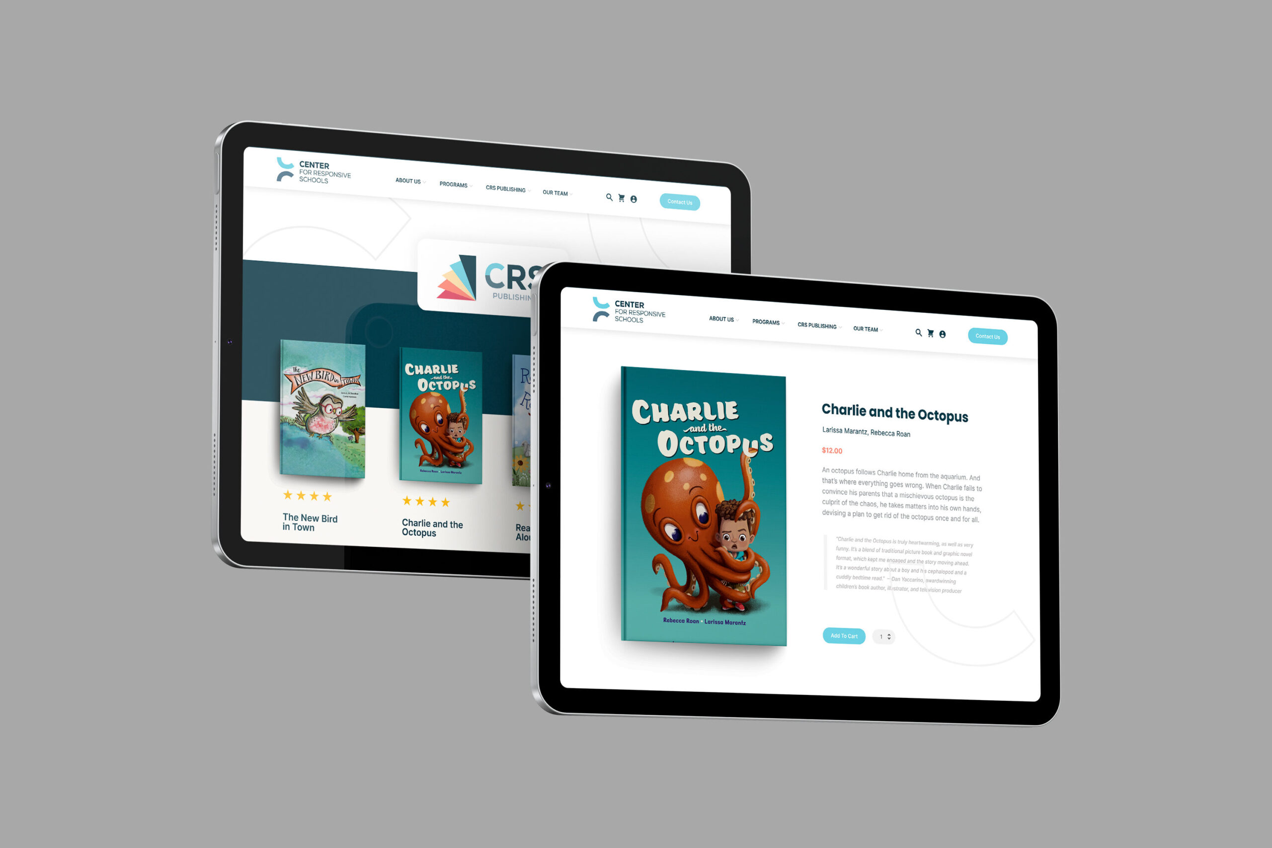
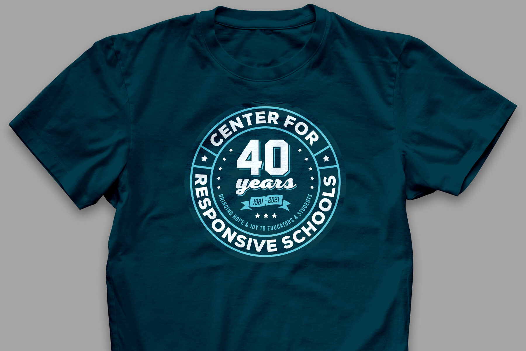
Center For Responsive Schools (CRS)
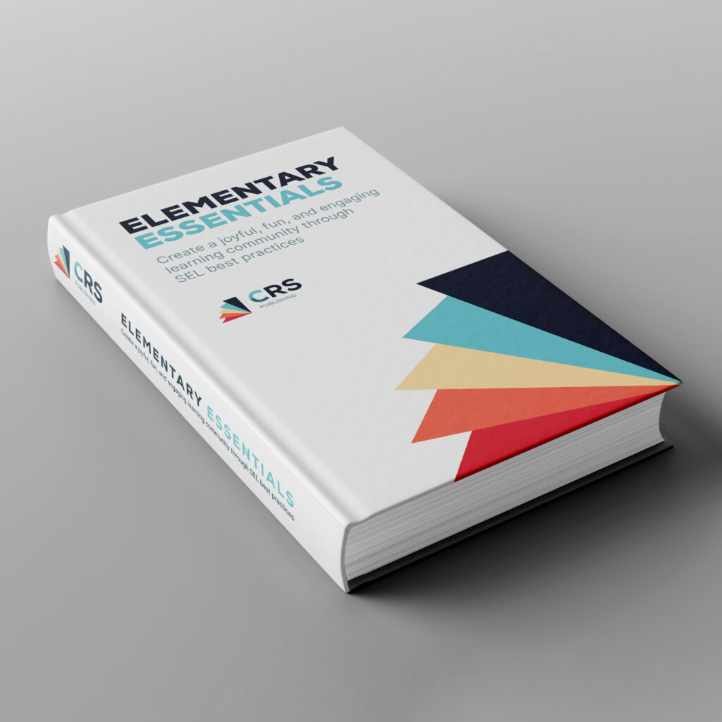
Center For Responsive Schools came to Gecko looking to do a branding refresh for their primary organization, as well as for CRS Publishing, their internal publishing house. The leadership team was looking for a mark that exemplified their core values; recognizing diversity, inclusion, and equity as essential to a positive and healthy school and classroom.
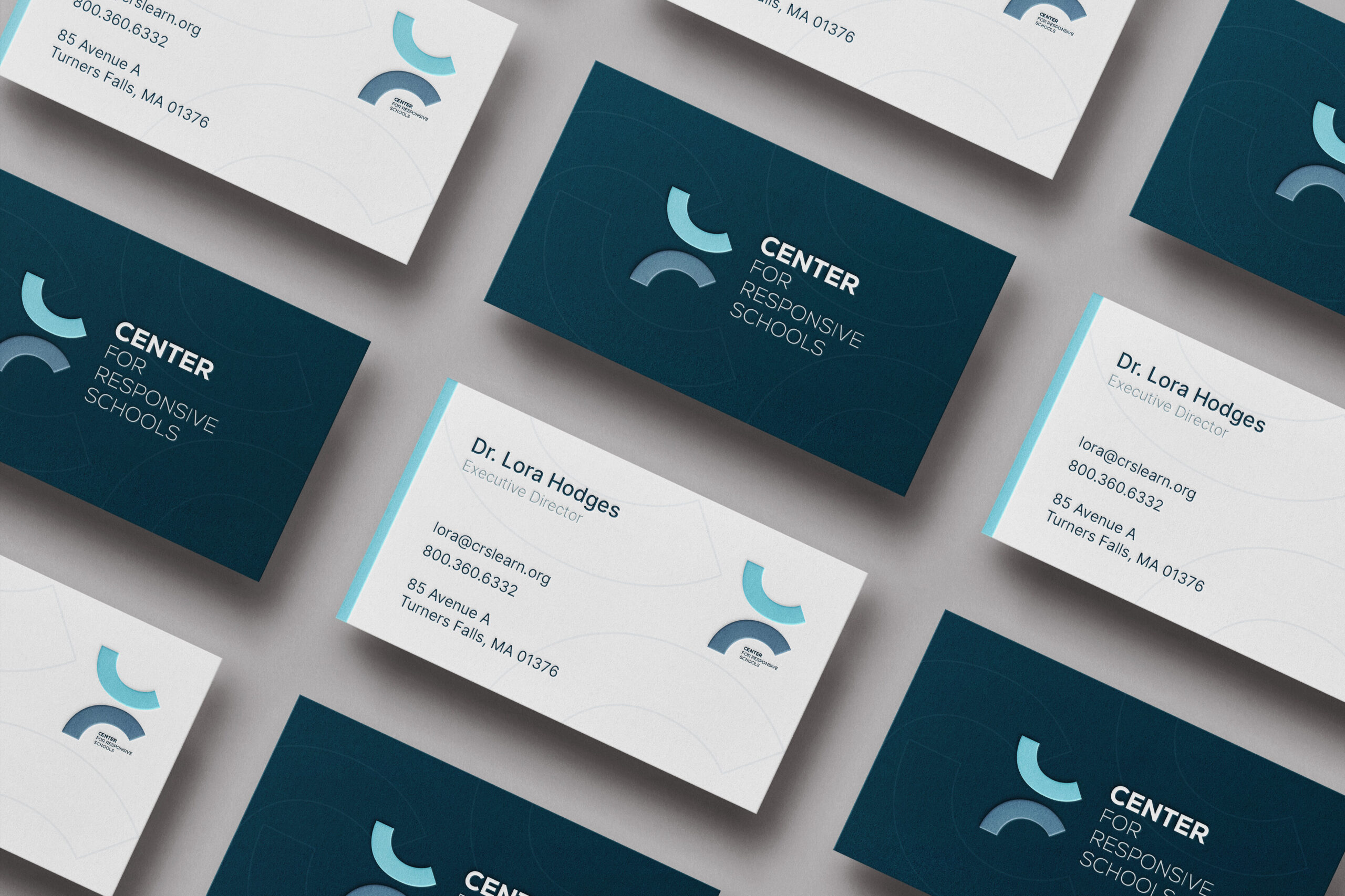
![]() Center For Responsive Schools in Turners Falls, Massachusetts
Center For Responsive Schools in Turners Falls, Massachusetts
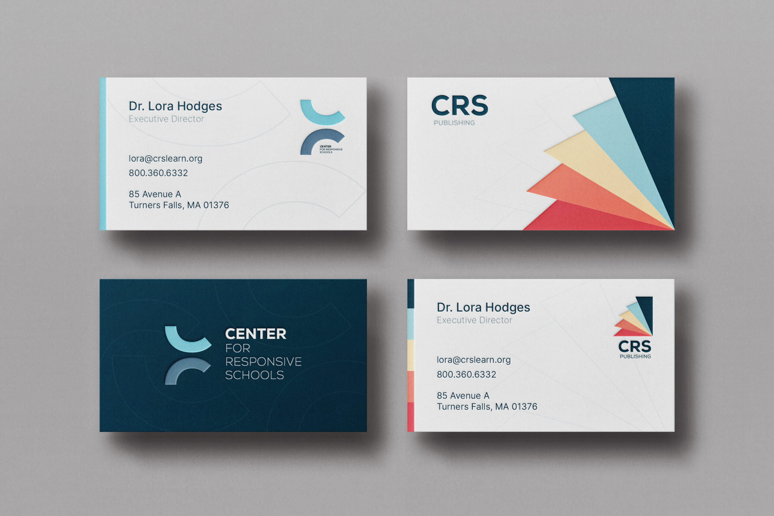
Complimentary Logos
As a well-known brand, our team began by researching Center For Responsive School’s competitors in order to avoid anything too similar (and secretly make our mark the best!). In that research, we were able to establish the color scheme and typography that would set CRS and CRS Publishing apart.
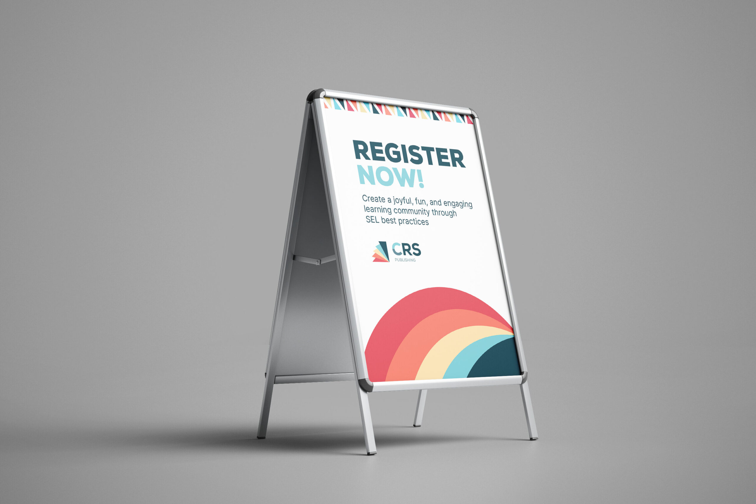
The two marks compliment each other with typography choices, shape, and color. The deconstructed “C” of CRS is found reconstructed in CRS Publishing’s mark.
We’re excited to be a part of an organization that strives for equity in education. Keep an eye out for the new branding in classrooms nationwide!