f’real
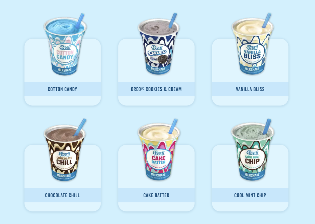
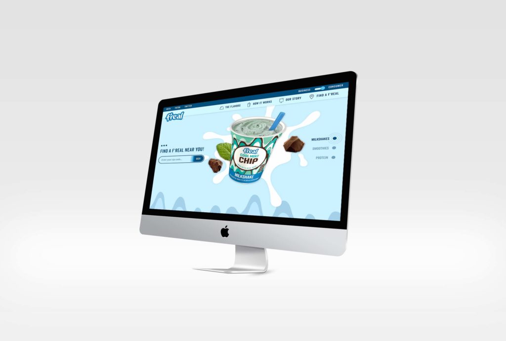
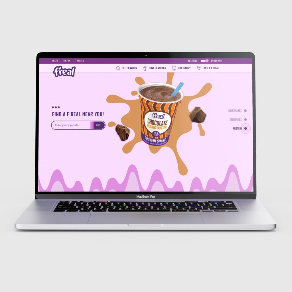
As a long time partner of f’real’s, our team was ecstatic when the company came back to us for an updated website design based on their new identity. During the research phase, we decided it was imperative for f’real to have a shape shifting site to show off their many personalities. The site changes from blue to pink to green depending on which category of convenient, gas station based beverage you’re looking for; milkshakes, smoothies, or protein.
![]() f’real Frozen Beverages in Gas Stations Everywhere
f’real Frozen Beverages in Gas Stations Everywhere
The Website
One of the most exciting features of the new f’real site is the new and improved “freal Finder.” On mobile or desktop, a f’real user can simply enter their current zip code and be taken to a sleek modal with all of the nearest f’real locations.
To date, the f’real website is one of our favorites. The smooth animations, bright graphics, and shape-shifting nature of the design really embodies who f’real is as an organization. We’d love to create a beautiful site like this for your organization!