Partnership Health Center (PHC)
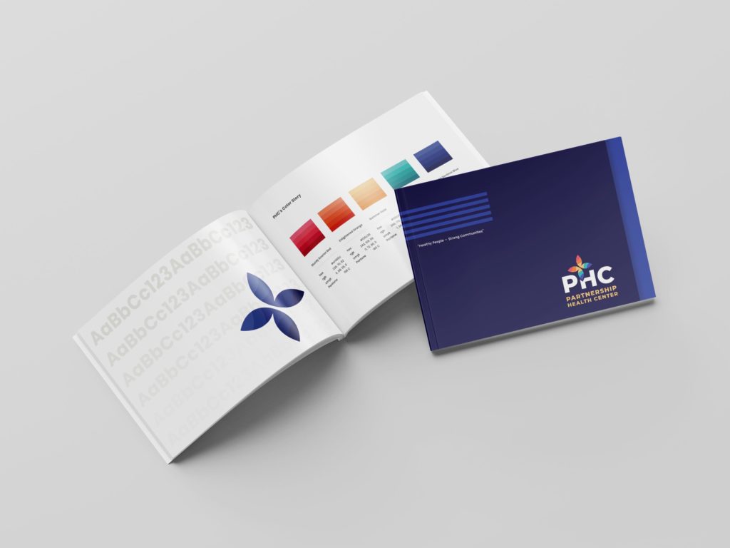
As a leading provider of high quality, inclusive, and affordable healthcare in Western Montana, Partnership Health Center (PHC) needed a strong, bright, and welcoming approach to their branding. The Gecko team worked with stakeholders at PHC to establish a mark and brand guide that would move their organization into the future. Check it out!
PHC in Missoula, Montana
The Mark
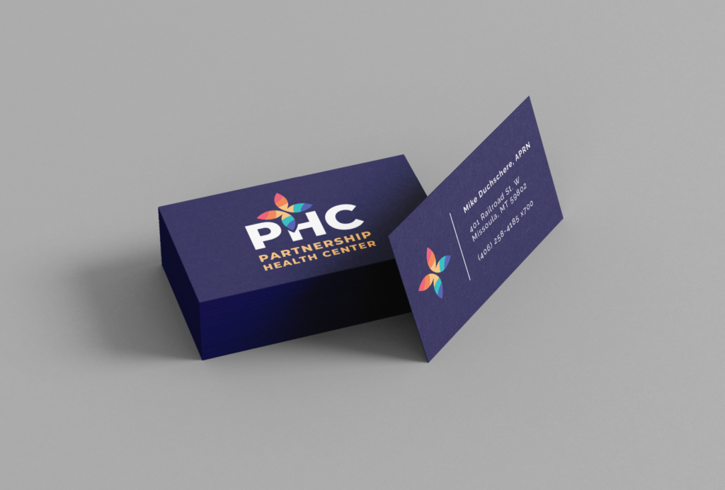
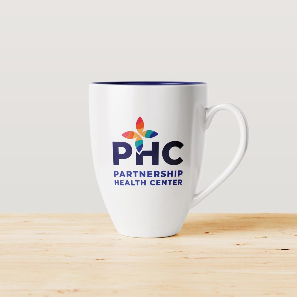
PHC was on a mission to develop a brand that reflected their community. As a provider of high quality care to members of all backgrounds, including the LGBTQ+ community, the joyful and symbolic nature of the rainbow became a recurring theme. The mark itself is intended to both symbolize the medical cross and a colorful, playful butterfly. The butterfly is seen in many traditions as a representation of renewal, hope, and betterment; all principles in PHC’s work and mission.
In order to set PHC apart from other organizations in the area using “Partnership” in their names, we strove to establish a typeset that incorporated the strength of PHC’s initialism. The multiple typesets provided give the client the ability to transition their company from “Partnership Health Center” to “PHC” over the next several years.
The mark itself can be used in a multitude of ways. PHC will utilize single gradient color variations of the mark to represent each of their four service lines; medical, dental, behavioral health, and pharmacy.
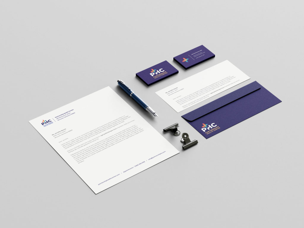
The Gecko team took great pride in crafting a strong, clean, fun, and welcoming brand for such a integral community partner. We’re excited to see their organization thrive for many years to come. In the gallery below you will find digital and print materials utilized by PHC in and around Western Montana.
